



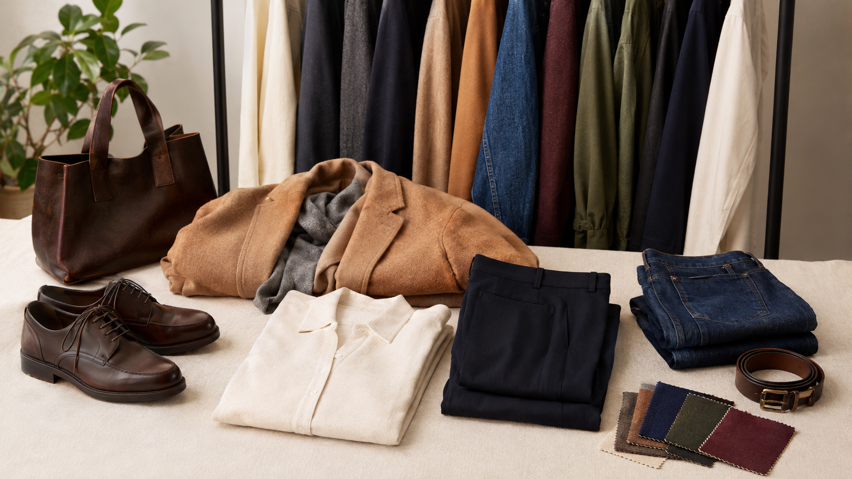
Learning how to choose a wardrobe color palette can make getting dressed easier without removing creativity from your clothes. A useful palette creates enough connection between garments that you can build outfits quickly, but it still leaves room for bright colours, prints and unexpected combinations.
You do not need to replace everything you own or restrict yourself to a small group of neutral shades. The best place to begin is your current wardrobe. The clothes you wear repeatedly already contain clues about the colours that feel comfortable, suit your routine and combine well with your favourite shoes and accessories.
Many people search for how to choose a wardrobe color palette because their wardrobe contains attractive individual pieces but very few complete outfits. One top may need a particular pair of trousers, while a colourful skirt may work with only one pair of shoes. A considered palette helps separate items feel like parts of the same wardrobe.
The goal is not perfect colour matching. It is to create a flexible system in which most everyday pieces have several believable partners.
Why a Wardrobe Colour Palette Is Useful
A wardrobe palette is a group of colours you enjoy wearing together. It usually includes dependable base shades, supporting neutrals and a few accent colours that add personality.
Understanding how to choose a wardrobe color palette helps you see the difference between a versatile garment and an isolated one. A deep green jumper may be highly useful if it works with your denim, cream trousers, brown coat and black skirt. A beige shirt may be less useful if the shade makes you feel washed out and you never choose it.
A thoughtful palette can help you:
- Create more outfits from existing clothes
- Coordinate tops, bottoms, layers and shoes
- Make prints easier to style
- Identify genuine gaps before shopping
- Avoid buying near-duplicate colours that do not combine well
- Pack for travel with fewer pieces
- Make a capsule wardrobe feel personal
- Use accessories more intentionally
Colour is only one part of a successful wardrobe. Fit, fabric, silhouette and comfort still matter. A perfectly coordinated jacket will not become useful if it restricts movement or does not suit your routine.
Start With the Clothes You Already Wear
The most practical answer to how to choose a wardrobe color palette is already hanging in your wardrobe. Begin by selecting ten to fifteen items you have worn frequently during the current season.
Include complete categories rather than choosing only tops. Look at trousers, jeans, skirts, dresses, jackets, knitwear, shoes, bags and scarves. Lay the pieces on a bed or hang them where you can see them together.
Notice which shades repeat. You may discover that navy appears in your trousers, coat and bag, while cream appears in several tops. Perhaps your wardrobe contains more olive than you realised, or every successful outfit includes some form of denim blue.
Then examine the clothes you rarely wear. Ask whether colour is part of the problem:
- Is the shade difficult to combine with your outerwear?
- Does it require shoes you do not own?
- Is it much brighter or softer than the rest of your wardrobe?
- Does the colour feel uncomfortable near your face?
- Does it show marks too easily for your routine?
- Did you buy it because it was fashionable rather than because you liked it?
- Is the colour appealing on its own but wrong for the garment?
Do not remove anything immediately. A rarely worn colour may become useful when paired differently. The purpose of this review is to understand your habits before making decisions.
Connect the Palette to Your Personal Style
Knowing how to choose a wardrobe color palette becomes easier when you understand the mood you want your clothes to create. The same colours can communicate different styles depending on their depth, contrast and fabric.
Black, white and red can feel sharp and graphic. Cream, tan and rust can appear warm and relaxed. Navy, pale blue and burgundy often feel classic, while cobalt, orange and bright pink can create a playful wardrobe.
Think about three words that describe your preferred style. If your words are soft, relaxed and natural, you may enjoy muted greens, warm neutrals and faded denim. If they are polished, modern and confident, a palette of black, cream, charcoal and one saturated accent may feel more suitable.
The process of finding your personal style naturally can help you identify the colours, silhouettes and details you already repeat. Your palette should support those preferences instead of placing a new aesthetic on top of them.
Choose Two or Three Base Colours
Base colours usually appear in the hardest-working parts of a wardrobe: trousers, jeans, coats, jackets, shoes and bags. When deciding how to choose a wardrobe color palette, select two or three bases that already work with your lifestyle.
Common base colours include:
- Black
- Navy
- Charcoal grey
- Chocolate brown
- Camel
- Cream
- Olive
- Denim blue
You do not need to use the most common options. Deep burgundy, forest green or warm taupe can also act as bases when they appear regularly across your wardrobe.
Your base colours should cooperate, but they do not need to match perfectly. Navy and black can look intentional when there is enough difference in fabric or depth. Brown and grey can work together when repeated elsewhere in the outfit. Cream may connect dark and light pieces more softly than bright white.
Try to choose bases that work across several categories. If navy only appears in one dress, it may be an accent rather than a true base. If black appears in your trousers, shoes, bag and outerwear, it is clearly doing more structural work.
People building a smaller wardrobe can use the same method when learning how to build a capsule wardrobe, where colour compatibility helps a limited group of clothes produce more outfits.
Decide Which Neutrals You Actually Like
An important part of how to choose a wardrobe color palette is accepting that not every neutral shade is automatically useful. Beige may be versatile in theory, but it will not help if you dislike wearing it. Black may coordinate easily, but it can feel too severe for someone who prefers low-contrast outfits.
Neutrals have undertones and depth. Cream can lean yellow, pink or grey. Brown may appear red, golden or cool. Grey can be blue-based or slightly warm. These differences explain why two garments described with the same colour name may not look harmonious together.
Place similar neutrals next to each other in daylight. They do not have to be identical. Slight variations can add depth, especially when the textures differ. However, one very yellow cream beside a cool pale grey may look accidental unless another element connects them.
Your ideal light neutral might be white, ivory, oatmeal, stone or pale grey. Your preferred dark neutral might be black, charcoal, navy, espresso or deep olive. Choosing one or two from each group creates useful light-and-dark options without requiring every neutral in the shop.
Add Accent Colours With a Clear Purpose
Accent colours bring energy and identity to a wardrobe. They often appear in tops, knitwear, dresses, scarves, bags, jewellery or occasional statement pieces.
When working out how to choose a wardrobe color palette, begin with two to four accents that you already enjoy. Look for colours that appear in favourite garments, photographs or accessories. You may prefer burgundy, forest green, mustard and rust, or you may feel more at home in cobalt, cool pink, emerald and lilac.
Test each accent against your base colours. An accent does not need to work with every base, but it should create at least two or three combinations you would genuinely wear.
For example, burgundy may work with:
- Navy trousers
- Grey knitwear
- Cream outerwear
- Dark denim
- Brown leather accessories
One bright colour can be enough for a quiet wardrobe. If you love colour, several accents can coexist when they share a similar mood. Muted colours often blend easily with other muted colours, while clear saturated shades can look intentional together when their strength is balanced.
Do not choose accent colours only because a chart says they are complementary. A theoretically balanced combination is useless if it does not feel like you.
Notice Which Colours Feel Good Near Your Face
Advice about undertones can be helpful, but it should not become a strict rule. The most reliable way to understand how to choose a wardrobe color palette is to compare actual garments in natural light.
Hold different colours near your face without heavy makeup or strongly coloured lighting. Notice whether a shade makes your complexion appear brighter, more even or more tired. Also notice your emotional response. A colour may not be described as ideal for your undertone, yet still make you feel energetic and confident.
Colours worn below the waist have less effect on the face. If you love a difficult shade, use it in trousers, skirts, shoes or bags. You can also place a preferred colour near the face through a scarf, shirt collar or jewellery.
Contrast matters as much as undertone. Someone with low natural contrast may enjoy soft combinations but can still wear black and white if the dramatic effect feels right. Personal preference should have the final word.
Decide How Much Contrast You Enjoy
Contrast describes the visual difference between the colours in an outfit. Recognising your preferred level of contrast is a useful stage in how to choose a wardrobe color palette.
High-contrast combinations include black with white, navy with bright yellow or deep green with pale pink. They create a clear, energetic effect and often make separate pieces look more defined.
Low-contrast outfits use colours with similar depth or softness. Cream with camel, charcoal with navy, or olive with brown can feel calm and connected. Tonal dressing uses several versions of one colour, such as chocolate, tan and beige.
Look at outfits you already enjoy. If you often wear a white shirt under a black jacket, stronger contrast may feel natural. If you prefer blue jeans, a blue shirt and a navy coat, tonal combinations may be more comfortable.
You do not need to select one contrast level permanently. A work wardrobe may be quieter while social outfits use bolder combinations. The palette simply needs enough range to support both.
Use Prints to Connect Several Colours
Prints can make a palette easier rather than more complicated. A striped shirt, checked blazer or patterned scarf can contain several colours already present in your wardrobe.
Learning how to choose a wardrobe color palette includes looking inside a print rather than treating it as one separate item. A floral dress containing cream, green and burgundy might work with a cream cardigan, green jacket, burgundy bag and brown boots.
When evaluating a print, identify:
- Its background colour
- The two most noticeable colours
- The smallest accent shades
- The overall level of contrast
- Whether the print feels warm, cool, soft or bright
- Which existing layers and shoes work with it
A print does not need to include every colour in your palette. It only needs enough connection to create complete outfits. If patterned clothing feels overwhelming, introduce print through a scarf, bag or small accessory.
Include Denim, Leather and Metallics
Denim is often treated as a neutral because it combines with so many colours. When planning how to choose a wardrobe color palette, include the washes you actually wear rather than writing only “blue.”
Dark indigo can feel polished and often works with deep jewel tones, white, camel and grey. Mid-blue denim has a relaxed quality and can connect bright or muted colours. Very pale denim creates lower contrast with light tops but may feel more seasonal.
The guide to choosing the right jeans can help you consider wash alongside rise, cut and fit.
Leather and leather-like accessories also have colour. Black shoes and belts can create a sharper finish, while brown, tan, oxblood or cream may feel softer. Your shoes and bags do not all need to match, but repeating a leather colour in two or three places makes it easier to use.
Metallics can be part of the palette too. Gold, silver, rose gold and mixed metals affect the mood of jewellery, bag hardware and shoe details. Choose the finish you enjoy rather than following an undertone rule automatically.
Adapt the Palette to Climate and Season
A practical approach to how to choose a wardrobe color palette considers the weather. Climate affects fabric, laundry, layering and how often certain colours are exposed to rain, dust or strong sunlight.
Warm-weather wardrobes often contain lighter fabrics and may use white, cream, pale blue or brighter accents. Dark colours can still work well when the fabric is breathable. Cold-weather wardrobes may rely more heavily on dark outerwear, boots and textured layers, but they do not need to become colourless.
You can maintain the same base colours throughout the year and rotate accents seasonally. A navy-and-cream wardrobe might use pale blue and coral in summer, then burgundy and forest green in winter.
Seasonal changes should feel practical rather than compulsory. If bright orange makes you happy in January, there is no reason to store it until autumn.
When colder weather requires several visible layers, layering clothes without looking bulky can help you balance colour, fabric weight and proportion.
Match Colour Choices to Your Daily Routine
Your schedule should influence how to choose a wardrobe color palette. Someone who works with children, travels on public transport or handles food may need colours that hide everyday marks. A person in a conservative workplace may rely on restrained bases while using accent colours in shirts, scarves and jewellery.
Think about where your clothes are worn:
- Work or study
- Commuting
- Home
- Social occasions
- Religious or community gatherings
- Exercise
- Travel
- Formal events
The amount of time spent in each setting should affect the amount of colour assigned to it. If most of your week is casual, your strongest colour connections should exist among jeans, knitwear, shirts, trainers and practical jackets.
Laundry also matters. White trousers may look ideal in a palette but be inconvenient if they require frequent washing. Very dark fabrics may show lint or fade quickly. The right colour is one you can maintain without frustration.
Test the Palette With Complete Outfits
The clearest test of how to choose a wardrobe color palette is whether it produces outfits you want to wear. Colour cards and digital mood boards are useful, but clothes behave differently because fabric texture, shape and proportion affect the result.
Choose one frequently worn bottom and combine it with at least three tops, two layers and two pairs of shoes. Photograph the successful combinations. Repeat the process with your other core trousers, skirts or dresses.
You may find that your proposed palette works in theory but lacks light tops, or that every outfit depends on the same black shoes. These are useful discoveries because they reveal specific gaps.
Outfit formulas make testing faster. The ideas in easy everyday outfit formulas can help you vary layers, shoes and accessories while keeping comfortable proportions.
Try the combinations in daylight and indoor light. Some colours that appear harmonious beside a window may look different under warm bulbs. They do not need to remain identical in every setting, but you should feel comfortable with the change.
Use Accessories to Repeat Colour
Accessories can introduce a new colour without requiring a major wardrobe change. A scarf, belt, bag or pair of shoes can repeat a small shade from a printed garment and make the outfit feel intentional.
When considering how to choose a wardrobe color palette, decide whether accessories should blend with the base colours or provide contrast. A black bag may disappear neatly into a dark outfit, while a red bag becomes a focal point.
You do not need matching shoes and bags. Instead, look for visual relationships. Brown boots may connect with a tortoiseshell frame, gold jewellery or a warm print. White trainers may relate to a white shirt or a small stripe in a jumper.
The guide to using accessories to complete an outfit explains how colour repetition, scale and placement can create balance without making every detail identical.
Shop With the Palette, Not for the Palette
Knowing how to choose a wardrobe color palette should reduce unnecessary shopping, not create a reason to replace useful clothes. Begin with what you own and buy only when outfit testing reveals a genuine need.
Carry photographs of your most-worn clothes or keep a simple palette note on your phone. When considering an item, ask:
- Does this colour work with at least two bottoms I own?
- Can I wear it with my current coat or jacket?
- Do my everyday shoes support it?
- Is the colour comfortable near my face?
- Does it suit the fabric and shape of the garment?
- Will it show marks or require difficult care?
- Am I attracted to the item or only to the shop styling?
- Does it fill a gap or duplicate something useful?
Colour names are unreliable across brands. One retailer’s camel may be another retailer’s beige or tobacco. Whenever possible, compare the new item with photographs or bring a small accessory that represents your palette.
Second-hand shopping can offer unusual shades and better-quality fabrics, but colour may fade unevenly. The thrift and vintage shopping guide explains how to inspect condition, fabric and previous alterations before buying.
Avoid Common Palette Mistakes
People learning how to choose a wardrobe color palette often make the system stricter than it needs to be. A palette is a decision-making tool, not a rulebook.
Common mistakes include:
- Choosing only neutrals because they appear versatile
- Copying someone else’s palette without considering your wardrobe
- Buying several new pieces before testing existing combinations
- Ignoring the colour of coats, shoes and bags
- Treating every version of beige, navy or white as identical
- Selecting accents that work with only one outfit
- Removing a favourite colour because it falls outside the plan
- Following undertone advice despite disliking the recommended shades
- Forgetting that fabric texture changes how colour appears
- Creating a palette for an imagined lifestyle
Another mistake is expecting every item to work with everything else. That level of compatibility is unnecessary and can make the wardrobe feel repetitive. A dress worn only with one jacket may still deserve its place if you enjoy the complete outfit and wear it regularly.
Allow the Palette to Change
Your colours can evolve as your lifestyle, taste and surroundings change. Understanding how to choose a wardrobe color palette does not mean making one permanent decision.
Review your wardrobe at the beginning or end of a season. Notice which colours you wore most, which combinations felt easy and which accents stayed untouched. A previously important base may become less useful, while a new colour begins appearing naturally.
Make changes gradually. Add one garment or accessory and test it with your existing wardrobe before expanding the colour further. This protects the connections you have already built.
Care also affects palette consistency. Dark clothes can fade, white garments can dull and bright colours may lose intensity when washed incorrectly. The advice in how to make clothes last longer can help protect colour and fabric over time.
Build a Palette You Can Actually Wear
The most useful answer to how to choose a wardrobe color palette is to pay attention to real outfits. Begin with the colours you already repeat, choose dependable bases, add accents you genuinely enjoy and test everything with your normal shoes, layers and accessories.
Your wardrobe does not need to look perfectly coordinated when viewed as a whole. It needs to produce enough comfortable, practical outfits for your actual week. Keep the colours that make dressing easier, leave room for the ones that simply make you happy and allow the palette to develop with you.
